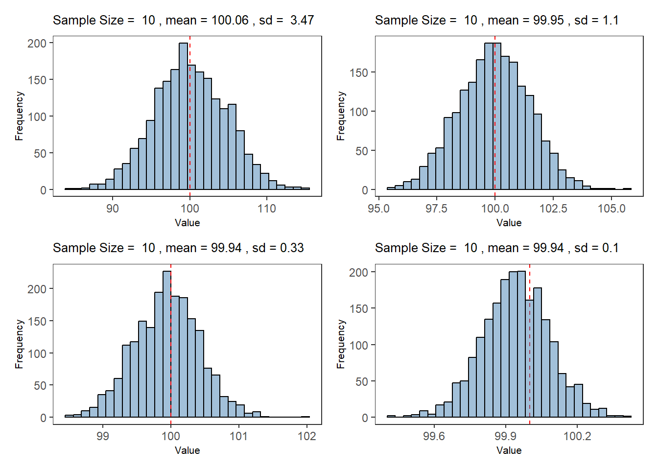
# 使用 ggplot2 绘制直方图size<-c(10, 100, 1000, 10000)p1<-ggplot(data =df_sample_10, aes(x =sample_mean))+geom_histogram(bins =30, fill ="steelblue", color ="black", alpha =0.5)+labs( title =bquote("Sample Size = "~.(size[1])~", mean ="~.(round(mean(df_sample_10$sample_mean), 2))~", sd = "~.(round(sd(df_sample_10$sample_sd), 2))), x ="Value", y ="Frequency")+geom_vline(xintercept =100, linetype ="dashed", color ="red")+theme_bw()+theme( panel.grid =element_blank(), title =element_text(size =8))p2<-ggplot(data =df_sample_100, aes(x =sample_mean))+geom_histogram(bins =30, fill ="steelblue", color ="black", alpha =0.5)+geom_vline(xintercept =100, linetype ="dashed", color ="red")+labs( title =bquote("Sample Size = "~.(size[1])~", mean ="~.(round(mean(df_sample_100$sample_mean), 2))~", sd ="~.(round(sd(df_sample_100$sample_sd), 2))), x ="Value", y ="Frequency")+theme_bw()+theme( panel.grid =element_blank(), title =element_text(size =8))p3<-ggplot(data =df_sample_1000, aes(x =sample_mean))+geom_histogram(bins =30, fill ="steelblue", color ="black", alpha =0.5)+geom_vline(xintercept =100, linetype ="dashed", color ="red")+labs( title =bquote("Sample Size = "~.(size[1])~", mean ="~.(round(mean(df_sample_1000$sample_mean), 2))~", sd ="~.(round(sd(df_sample_1000$sample_sd), 2))), x ="Value", y ="Frequency")+theme_bw()+theme( panel.grid =element_blank(), title =element_text(size =8))p4<-ggplot(data =df_sample_10000, aes(x =sample_mean))+geom_vline(xintercept =100, linetype ="dashed", color ="red")+geom_histogram(bins =30, fill ="steelblue", color ="black", alpha =0.5)+labs( title =bquote("Sample Size = "~.(size[1])~", mean ="~.(round(mean(df_sample_10000$sample_mean), 2))~", sd ="~.(round(sd(df_sample_10000$sample_sd), 2))), x ="Value", y ="Frequency")+theme_bw()+theme( panel.grid =element_blank(), title =element_text(size =8))(p1+p2)/(p3+p4)